
Clustering points in 2D – From the LHC to Art Exhibits
Published:
Reading time: 20 minutes
Where’d you get the idea, Matt?
My wife works as a psychology researcher studying vision and its interplay with the other senses. She’s part of a generation of psychologists whose careers have progressed concurrently with the development of consumer-grade virtual reality (VR) equipment. Ever since Oculus’ DK2 headset, she’s always had the fanciest toys to play with, and this equipment allows her to ask and answer questions that would not be possible without the development of VR. Her experiments are created using the Unity engine, and when she’s collecting data from participants, she’s able to record the frame-by-frame location of the participant as they wander around the virtual environment.
She was recently approached by the anthropology department to see where people most often take pictures of famous statues. High-quality 3D models of statues like Hercules or Boy Strangling Goose were provided (nudity warning for both), and after creating a virtual museum to hold the statues, participants were asked to wander around the statue, taking as many virtual pictures as they like of the virtual statues. VR allowed the precise photo locations to be recorded, and a standard heatmap library allows the most popular locations to be visualized.
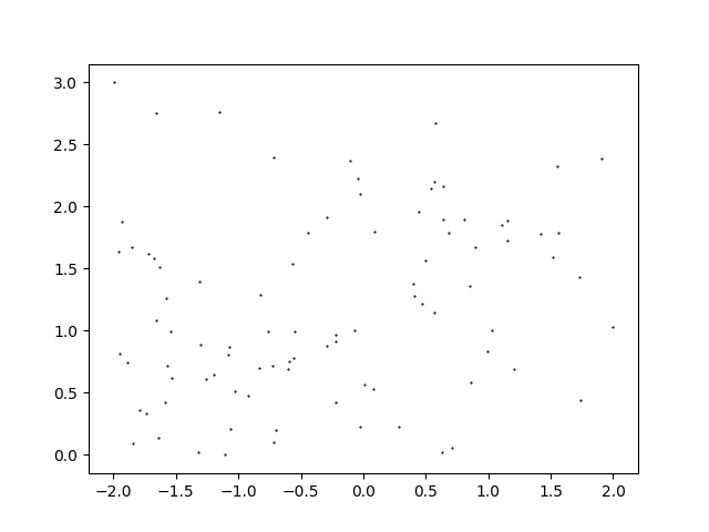
Beyond simply seeing where participants have taken a picture, a question that the anthropology department wanted answered was how many popular photo locations existed for each statue. The thinking goes that some of the provided statues are single-perspective while others are multi-perspective, and that this should be reflected in the number of popular photo locations. My wife and I talk a lot about how to approach data analysis, and I mentioned that particle physics experiments often need to form and count clusters. She sent me the data to play around with, and so here we are: finding and counting clusters of 2D datapoints. Since her own analysis is not yet published, I’ll be using dummy data⭳, shown below, to showcase the algorithms.
The Physics Approach to Clustering
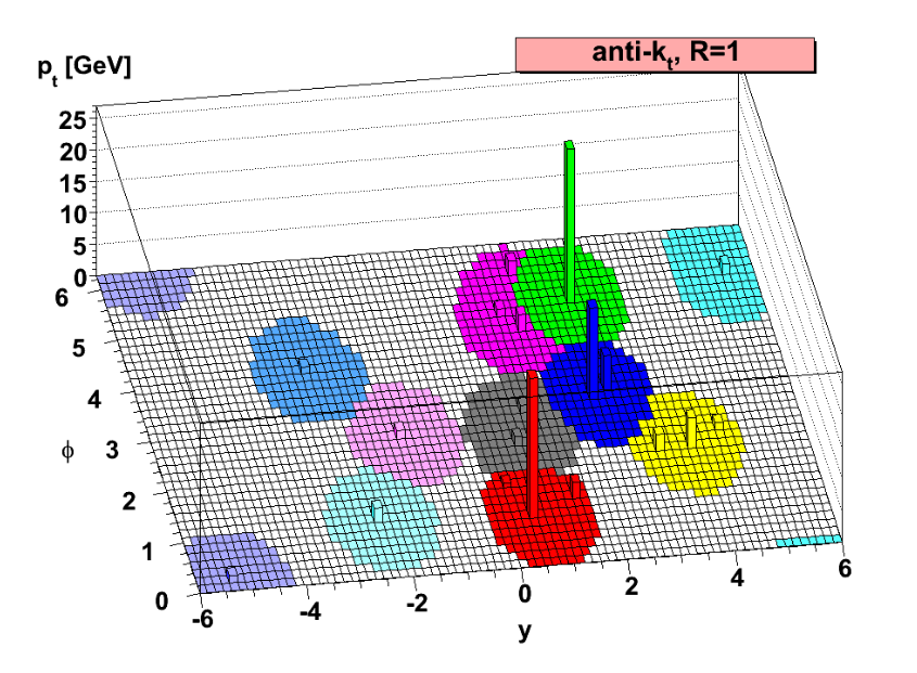
When two particles collide at high energies, they rip each other apart and spray out a plethora of other particles that are subsequently measured in the detector. Certain kinds of these detected particles often clump together, and due to their highly energetic nature they are called jets. Numerical clustering algorithms, often called jet definitions, are used to find the precise locations and energies of these clumps of particles. One particularly famous jet definition is called the “anti-kT algorithm”.
The Anti-\(k_T\) Algorithm
Notating the 2D position of a point \(n\) as \(\vec{r}_n\), imagine we are given a set of \(N\) points {\(\vec{r}_n\)}. To each point we assign an “energy” \(E_n = 1/N\) such that the energies sum to 1. We begin by forming a list of “pseudo clusters” {\(p_n\)}, defined initially as the pair
\[p_n = (E_n, \vec{r}_n)\]From here we begin a loop that only terminates when the list of pseudo clusters is empty. We first calculate for each pseudo the “discriminator”
\[d_i = 1/E_i^2\]We also calculate, for each pair of pseudos, the “distance measure”
\[d_{ij} = \min(d_i,d_j) \frac{|\vec{r_i}-\vec{r}_j|^2}{R^2}\]where \(R\) is an arbitrary parameter for the algorithm and in effect decides the radius of a cluster. Then, comparing all discriminators and all distance measures, a choice is made. If a distance measure \(d_{ij}\) is the smallest, then the two pseudos with labels \(i\) and \(j\) are combined in the vector sum
\[p_{\mathrm{new}} = \left(E_i+E_j, \frac{E_i\vec{r}_i + E_j\vec{r}_j}{E_i+E_j}\right) .\]Essentially, the energy of the new pseudo cluster is the sum of the energies of its constituents, and its position is the weighted average of its constituents’ positions. The two pseudos \(i\) and \(j\) are then removed from the list of pseudos, and the new one is added.
If instead a discriminator \(d_i\) is the smallest, the pseudo \(i\) is removed from the list of pseudo clusters. Its fate then depends on its energy: If it has an energy \(E > E_{\mathrm{cut}}\) then it is added to a list of “true clusters”. But if its energy is less than \(E_{\mathrm{cut}}\), the pseudo is simply discarded.
Notice that there are two parameters to this algorithm: \(R\), the radius of a cluster, and \(E_{\mathrm{cut}}\), the minimum cutoff energy for a cluster. The particular values chosen are situation-dependent, so physical intuition plays somewhat of a role. In the case of finding clusters of where people take pictures in a museum, we might assert that people taking pictures within one average arm length (0.65 m) of each other are in the “same location”, and therefore we might choose \(R = 0.65\,m\). The energy cutoff is a little bit trickier. In the way we’ve set up the energy assignments to each point, a cluster’s energy corresponds to the proportion of points that constituate that cluster. If we expect to see a maximum of, say, 5 clusters, then the average energy of those 5 clusters should be around 0.2. So we might set $E_\mathrm{cut} = 0.2$.
Performance
With these parameters we get the following clustering for the sample data: 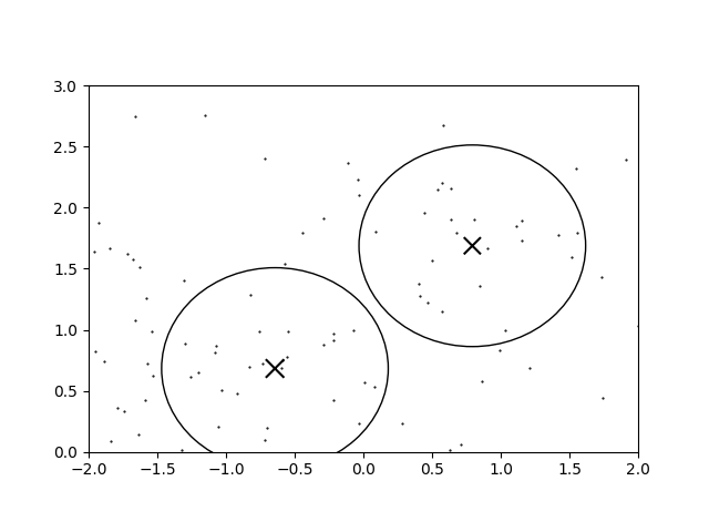
The circles denote the regions wherein a newly-added infinitesimally energetic point would join that cluster. It doesn’t look terrible, but when a heatmap is overlaid, 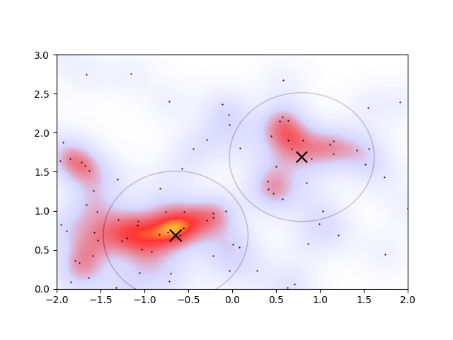
the drawbacks of this approach begin to appear. Based on the heatmap, the circles denoting the clusters are the wrong size and shape. Of course the parameters could be better tuned, but it’s finnicky: changing \(E_\mathrm{cut}\) to 0.1 in order to capture some more of the overdense regions, the algorithm gives another cluster. 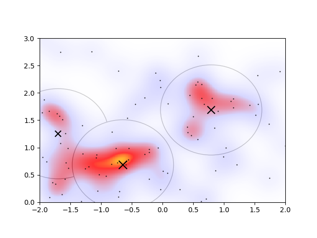
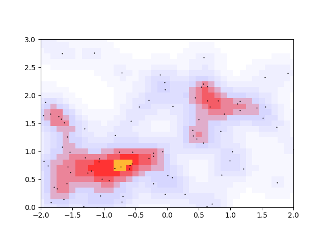
Alternatively changing the radius to \(R=0.3\,m\) to account for the heatmap’s apparent cluster size, and accordingly decreasing the cutoff to \(E_\mathrm{cut}=0.05\) to account for the smaller proportion of points in smaller clusters, we see a good agreement of the clustering with the overdensities on the heatmap 
However, there are now two overlapping clusters associated with the overdense region connected to the orange peak. I would even argue that the lower-left cluster should be a part of the extended irregular-shaped overdense region connected with the orange peak. In an ideal algorithm, I’d therefore expect that the overlapping regions would somehow merge, and that the lower-left cluster would not be considered a cluster at all.
The Heatmap Approach to Clustering
Well, if we’re judging the goodness of an algorithm based off how well it compares to a heatmap, we might as well just use the heatmap itself. Let’s first define how we’re generating a heatmap in the first place.
Heatmaps
Heatmaps are made by taking the raw datapoints and “smearing” them a little to get a continuous 2D density distribution. Mathematically, the density \(\rho\) is a function of the 2D position \(\vec{r}\) and is given by the 2D convolution
\[\rho(\vec{r}) = S(\vec{r}) \ast D(\vec{r})\]where \(S(\vec{r})\) is some Smearing function (like the 2D Normal Distribution) and \(D(\vec{r})\) is the Dataset, represented as a sum of pointlike impulses. Using the Dirac delta \(\delta(\vec{r})\) to represent pointlike distributions, I write
\[D(\vec{r}) = \sum_{i=1}^{N} \delta(\vec{r}-\vec{r}_i)\]where \(\vec{r}_i\) are the positions of each of the points in the dataset, as in the previous section. Together with the Normal distribution as the smearing function
\[S(\vec{r}) = N_\sigma(\vec{r}) \sim A \exp\left[-\frac{\vec{r}^2}{2\sigma^2}\right]\]we get that, after using the definition of a 2D convolution, the density is
\[\rho(\vec{r}) = A \sum_{i=1}^{N} \exp\left[-\frac{(\vec{r}-\vec{r}_i)^2}{2\sigma^2}\right] .\]The normalization factor \(A\) is then chosen to keep all densities in the interval \(0<\rho(\vec{r})<1\).
Now, if we provide a smear size \(\sigma\), we have access to the density of pixels anywhere in the region of interest. But what value of \(\sigma\) should we choose? Of course, you could keep trying different smear sizes, plotting the heatmap, and iterating until you have an image that looks appropriate to your own eye. But if you wanted to get a more principled estimate, we can use some of our data to infer something about the expected distance scale between datapoints. If we find the minimum and maximum x and y values of our dataset, the region we’re working in has an area \(A = (x_\mathrm{max}-x_\mathrm{min})(y_\mathrm{max}-y_\mathrm{min})\). At the same time, let’s assume that our dataset consists of \(N\) points that are spaced uniformly, each with a distance \(d\) from their nearest neighbour. We should then be picturing \(N\) circles with radius \(d\), with each circle containing a single point, and the net area of these circles should be \(A=N\cdot\pi d^2\). Rearranging for the distance estimate \(d\), we get \(d=\sqrt{A/\pi N}\).
Using this distance \(d\) as an estimate for the smear parameter \(\sigma\), we get the heatmaps that are shown above in the previous section.
Peak Finding
But how do we identify the peaks? They’re quite clear to the human eye, but to a computer it’s less obvious. With the usual starting idea of gradient ascent, how might we guarantee that all maxima are found? Over a finite region, we could initialize a grid of starting seeds that evolve through the ascent algorithm, but that feels numerically inefficient. After all, a starting grid would have to be fairly fine-grained to ensure all peaks are found, and while the ascent algorithm is fairly fast, applying that algorithm to each of the \(N_x \times N_y\) seeds would be very slow. Well if we’re sampling a grid of points in the first place, we might as well just use those points themselves to find the peaks. If we coarse grain the grid, an exhaustive search on a finite area becomes relatively inexpensive.

Finding a local maximum on a discretized domain is relatively easy: you just look for the pixels that have a higher density than its four nearest neighbours.

The green dots here represent all the local maxima. There are a few issues, however, with this peak-finding prescription.
- See how the orange overdensity has two nearly adjacent maxima? They should be considered to be part of the same overdensity region
- The bottom-left green peak should be part of the overdense region connected to the orange peak.
- There is no information about the size or orientation of an overdensity region
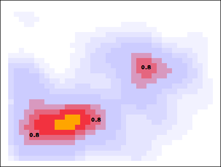
The first two issues are a matter of unavoidable noise in the density distribution, and the last issue should come down to being able to identify which pixels near a peak are also close in density to that peak. These 3 issues can be solved at once by discretizing the allowable densities. Choosing the 11 decimal-rounded intervals \((0<\rho<0.05, 0.05<\rho<0.15, ..., 0.95<\rho<1)\), we get
This seems to solve the 3 issues enumerated above. The original two orange peaks have merged, the spurious bottom-left peak no longer looks like a peak, and the size of the merged peak regions give a rough size and orientation of the cluster.
Okay but now that we’ve discretized in density, a simple nearest-neighbour approach to finding maxima won’t work. I quickly discovered that if a pixel is a peak in both its row and its column, that does not mean that it is part of an actual peak. For example, consider this pixel here ![]()
Along both the horizontal and vertical black lines it has the highest (discretized) density, apparently forming a peak in both the x- and y-directions. But its left- and down-adjacent pixels, which share this apparent peak density, are clearly not peaks because they themselves are adjacent to pixels with a higher density.
If the higher-density regions could flood into adjacent, lower-density regions, then those lower density regions could be removed as candidates for a density peak. This is the way I’ve approached peak-identification. For each threshold (the possible discretized densities {0.0,0.1,…,0.9,1.0}), all pixels at that threshold are considered to be a candidate to be a peak. Then a flood-fill algorithm progressively removes pixels as candidates if the candidate is adjacent to a pixel with a higher density. Those pixels remaining after the flood are the true peaks at that threshold.
Below I showcase this flood-fill with the same data, but with a slightly larger smearing size. When looking for peaks at a threshold density of 0.8, the higher density pixels flood into those pixels, and the pixels that survive are considered to be a cluster.
The algorithm is now complete. The orthogonally-connected pixels form a region called a “peak”, and their center is taken to be the mean position of the pixels. Returning to the story in the introduction, one scientific use-case for this algorithm might involve asking the question “how many popular spots are there to take pictures of this statue?”. With this algorithm specified, along with the smear size (\(R=0.205\,m\)) and the minimum density required to call a peak popular (\(\rho_\mathrm{min} = 0.75\)), the question can be answered: there are two popular peaks here! 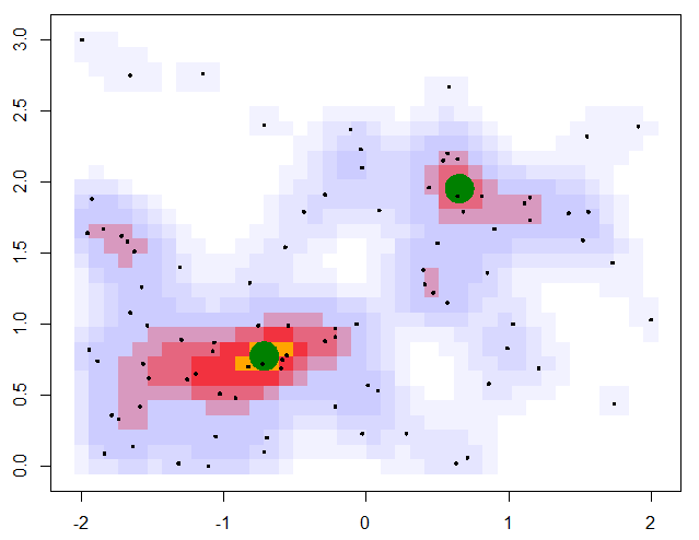
Visualizing Size and Orientation
Once all the contiguous pixels of a peak have been identified and collected, it’s possible to visualize more than just the peak’s location and height. The peak’s size and orientation are also interesting descriptive statistics that can inform about important information like precision, correlation, drift, etc. If we think about these peaks as 2D Normal distributions, the typical visualization scheme is to plot an ellipse at the center of the distribution, with its half-length and half-width corresponding to the standard deviations along the principal axes. Then just like error bars denote the 66.8% confidence region for 1D data, the ellipse denotes the 39.3% confidence region in 2D.
So our goal will be to collect the locations of all pixels associated with a peak, and we will fit an ellipse to their shape. In order to get the principal axes of the peak, we need to determine the angle through which we need to rotate our peak’s pixels so that the new x- and y-coordinates become decorrelated. Using the standard rotation matrices, the new coordinates (\(\xi\), \(\eta\)) are written in terms of the usual coordinates (\(x\),\(y\)) as
\[\xi = \ x \cos(\theta) + y \sin(\theta)\] \[\eta = -x \sin(\theta) + y \cos(\theta) .\]With these new coordinates, ensuring that their covariance is zero is as simple as finding the rotation angle such that
\[\mathrm{cov}[\xi,\eta] = \mathrm{cov}[x \cos(\theta) + y \sin(\theta),-x \sin(\theta) + y \cos(\theta)] = 0\]From the bilinearity of the covariance, this vanishing of the covariance occurs when
\[\tan(2\theta) = \frac{2 \mathrm{cov}[x,y]}{\mathrm{cov}[x,x] - \mathrm{cov}[y,y]}\]The outcome of this technique is shown below. The points in the original peak (left) are rotated through an angle \(\theta\) (positive counter-clockwise), with the resulting rotated points having zero correlation (right).
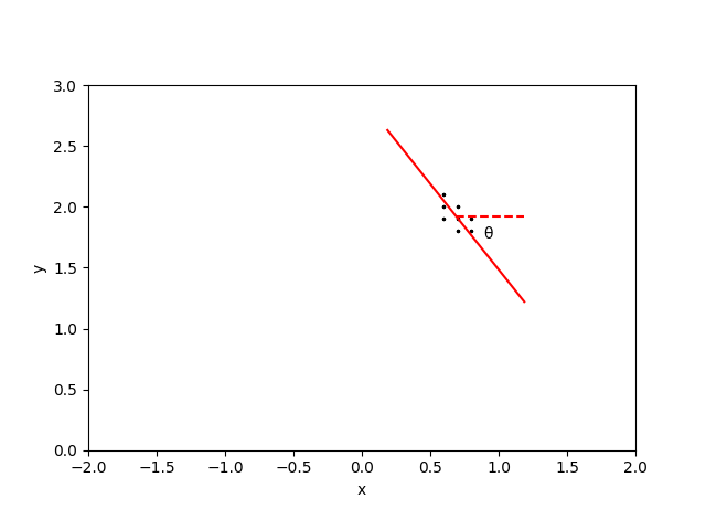
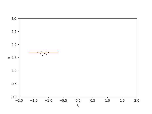
The half-length of the cluster is then \(L = [\max(\xi) - \min(\xi)]/2\) and the half-width of the cluster is \(W = [\max(\eta) - \min(\eta)]/2\). In order to also visually demonstrate the prominence of a peak, I’ll multiply these lengths and widths by twice the peak threshold.
With this definition of an ellipse, we now have visual confirmation of the general size and orientation of the overdensities that we could already see with our eyes. 
Making an R Package
After asking by wife about typical practices in her lab, I learned that her colleagues typically use R or Matlab to program their analyses, but that Matlab is being phased out due to licensing fees. While I had written most of the anti-kT code in Python, I was glad for an opportunity to practice my R skills, and thought it would be good practice to make the solution available everywhere by turning it into an installable R package.
Following this guide by Fong Chun Chan, I got to work building the heatmap-based algorithm into an R package called ClusterByDensity, now available on Github. It’s a pretty simple matter of writing the roxygen2 function documentation for all the functions you want to expose to the user, combined with repeated use of devtools::document() and devtools::load_all() for the build-test cycle.
You can now download the package using devtools::install_github('MattInglisWhalen/ClusterByDensity') or remotes::install_github('MattInglisWhalen/ClusterByDensity'). If you have no need for visualization then the package should be self-contained, but if you want the pretty plots you’ll also need to install plotrix. For a sample use-case, try running example_with_plotting.R in your favourite R environment with the dummy data⤓ we’ve been using throughout this post, which should generate the same heatmap and ellipses that you’ve grown to know and love.
Tags: #peak-finding #R #ClusterByDensity #clustering